Most resource pages fail for the same reason. They look curated, but they don't behave like durable assets. The institutional models are a good reminder of what makes a page useful: background sources help people gain context and discover better search terms, while primary sources act as the raw material users return to when they need substance, not summaries, as explained by Rowan University's history background guide. That same pattern scales up. The American Historical Association highlights collections with more than 700,000 digitized pages, which shows why strong resource hubs win when they combine curation, structure, and enough depth to support repeated use.
That's the benchmark for a strong resource page example. It isn't a prettier blog archive. It's an organized entry point that helps people find, compare, and use material quickly.
Commercial teams can learn a lot from that model. The best SaaS resource hubs don't just dump ebooks, webinars, and templates into one folder. They build clear taxonomies, create linkable subpages, and give search engines strong internal paths to follow. Below are seven resource page examples worth studying for their SEO and link-building mechanics, not just their design.
Table of Contents
- 1. HubSpot Resource Library
- 2. Zapier Guides
- 3. Stripe Developer Resources
- 4. Webflow University
- 5. Shopify Help Center
- 6. Intercom Learning Center
- 7. Twilio Segment Resources
- Top 7 Resource Page Comparison
- Your Playbook for a High-Performance Resource Page
1. HubSpot Resource Library
If you want a commercial benchmark, start with the HubSpot Resource Library. It handles scale well because the page gives users multiple ways to narrow intent fast: topic, format, and asset type. That sounds simple, but it's the difference between a library and a landfill.
Here's the interface marketers usually recognize first:
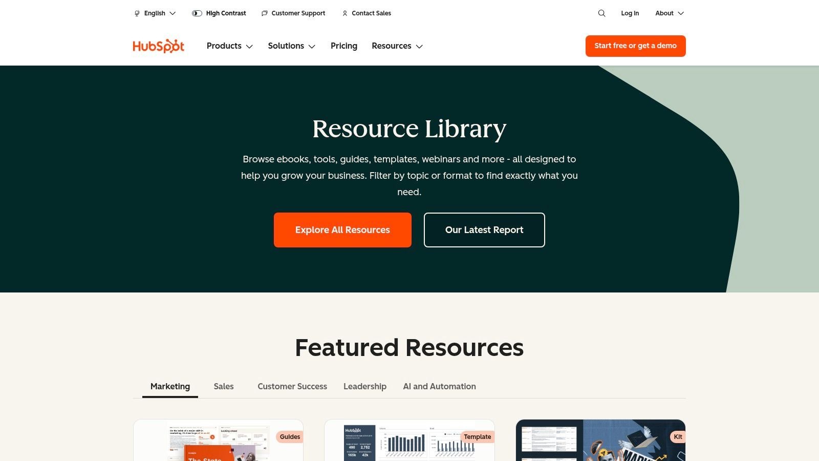
HubSpot also understands that a resource hub has to support two jobs at once. It needs to educate broad audiences with ungated or lightly gated content, and it needs to create enough asset-level intent for lead capture. That balance is hard to get right. Too much gating kills discovery. Too little structure turns the page into free content with no business path.
What HubSpot gets right
Three mechanics stand out:
- Filter logic matches user intent: Visitors don't need to know exact titles. They can browse by format or topic and still land on relevant assets.
- Asset pages are linkable on their own: Template pages, reports, and guides can earn links independently instead of relying on the main library page.
- Collections create seasonal relevance: Featured reports and trend-driven roundups give the hub fresh entry points without rebuilding the whole architecture.
The trade-off is volume. Without strong filters, a large library becomes noisy fast. HubSpot avoids most of that by leaning on clear categorization and consistent landing page templates, which is exactly what strong site structure for SEO is supposed to do.
Practical rule: If your resource page can't be sliced into meaningful sub-collections, it probably isn't a resource hub yet. It's just content storage.
2. Zapier Guides
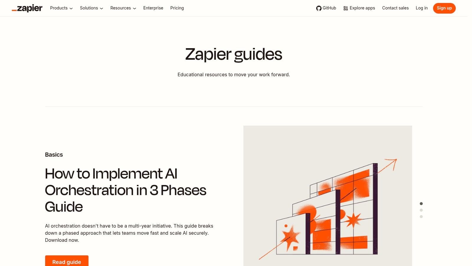
Zapier Guides is a different model. It doesn't feel like a classic resource library first. It feels like a teaching engine tied closely to a product ecosystem.
That distinction matters for SEO. A lot of teams build resource pages around assets they want to promote. Zapier builds around workflows users already want to complete. Quick-start tutorials, automation explainers, and AI-related learning paths pull in broad interest, then route readers toward deeper help content and product-specific next steps.
Where the SEO value shows up
The internal linking pattern is the primary lesson. Guides connect naturally into product documentation, support content, and adjacent editorial pieces. That gives search engines a stronger understanding of topic depth while helping users move from education to execution. From an organic search standpoint, that's a cleaner setup than publishing isolated blog posts with no path forward. It also reflects the basic mechanics behind understanding search engine optimization, where relevance improves when content is connected around user tasks instead of scattered by publication date.
What doesn't work as well is the boundary between Guides, Blog, and Help. For a new visitor, those lines can blur. The upside is breadth. The downside is occasional navigation friction.
A good takeaway from Zapier is this: educational resource pages attract better links when they solve a job from start to finish. A page that teaches automation strategy and then points users to execution steps is more useful than a page that lists "recommended reads."
Resource pages earn better links when the curator acts like a teacher, not a catalog manager.
3. Stripe Developer Resources
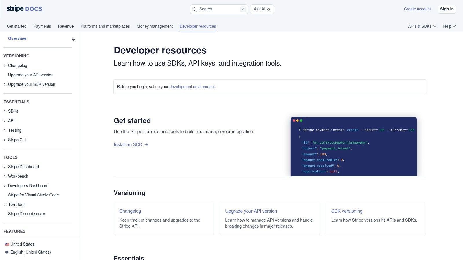
Stripe Developer Resources shows what a resource page example looks like when the audience is technical and the goal is implementation speed. This hub sits inside documentation, which limits some top-funnel reach, but it sharply improves usefulness for developers who need to ship, test, and troubleshoot.
That's an important trade-off. Marketers often want every resource page to behave like a traffic magnet. Stripe prioritizes task completion. Developers get direct access to tools like the CLI, SDKs, sample apps, and setup guidance tied to real jobs, such as reaching a first transaction quickly.
Why this works for links
Technical resource hubs earn links for a different reason than marketing libraries. They become references. Engineers link to them in tutorials, implementation notes, community threads, and integration walkthroughs because the material is concrete and current.
That kind of authority compounds when the domain already has strong trust signals, but the underlying principle still applies to smaller companies. If your resource page gives practitioners tools, examples, and fast paths to success, it can support brand visibility in the same way teams try to improve domain authority. Not by chasing vanity links, but by publishing assets people need while doing real work.
A few limits are obvious:
- Narrow audience fit: Non-technical buyers won't spend much time here.
- Reduced marketing discoverability: Because the hub lives inside docs, some broader search opportunities go elsewhere.
- Less narrative persuasion: The page is optimized for utility, not storytelling.
That said, Stripe is a strong reminder that some of the best resource pages aren't flashy. They're operational.
4. Webflow University
Webflow University is one of the clearest examples of a resource page built for depth, not just browsing. Instead of acting like a shelf of downloadable assets, it behaves like a structured curriculum.
That changes how people use it and how they link to it. Teachers, creators, agencies, and in-house teams can point to a course or lesson sequence, not just a generic help article. For link building, that matters because sequence-based content has a stronger return pattern. People revisit it.
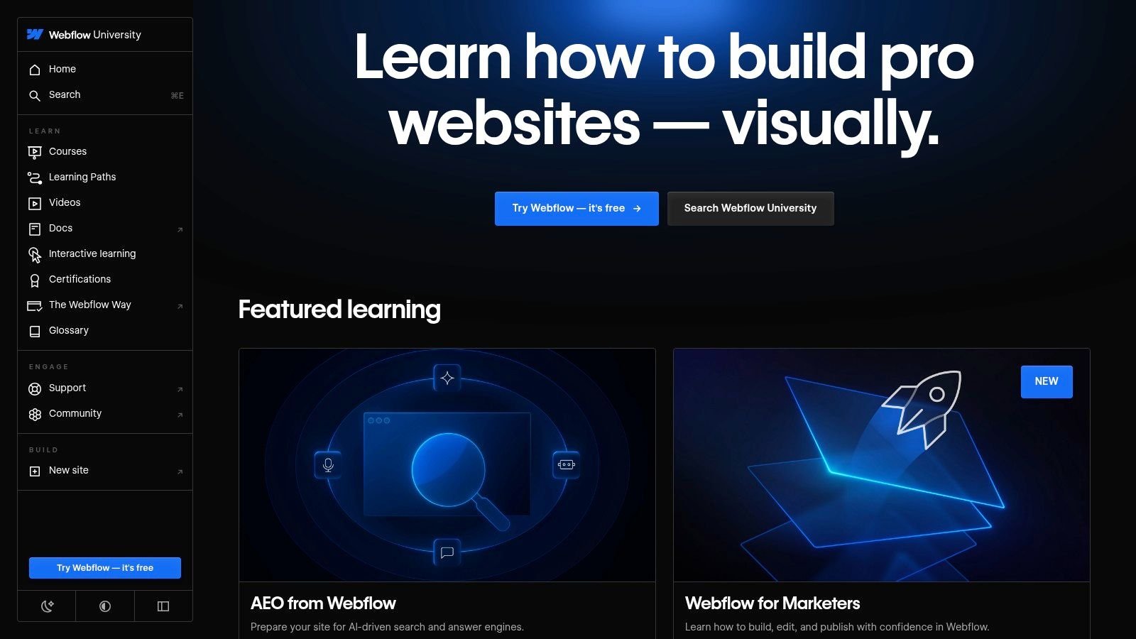
What to borrow from Webflow
The standout move is progression. Users can start with short lessons, move into broader courses, and keep navigating into related content without feeling dropped into a maze. Video-heavy hubs often fail because they treat every lesson as equal. Webflow gives users a visible path.
That structure aligns with how major institutions now design resource pages for instructional use. The National Archives highlights 100 milestone documents and pairs source access with educator-facing activities, while the Library of Congress advises educators to choose sources based on learning goals, accessibility, and guided analysis tools, summarized in Edutopia's overview of primary-source teaching resources. The lesson for marketers is straightforward. A resource hub gets stronger when it teaches people how to use the material, not just where to click.
Field note: If you publish video tutorials, add a learning path around them. Standalone videos are content. Ordered lessons become a resource system.
The downside is familiar. Product-centered examples can narrow broader appeal, and deep course catalogs can create a learning curve. But if you're building a resource center for adoption, onboarding, or certification, Webflow's structure is one of the best models available.
5. Shopify Help Center
The Shopify Help Center isn't marketed like a glossy content hub, but it functions as one for merchants. That's why it deserves a spot here. Resource pages don't need to look editorial to be effective. They need to reduce friction and cover the full journey.
Shopify does that with task-oriented navigation. Setup, migration, selling, payments, themes, and operations all have clear pathways. Search is central, which is the right decision for a help-heavy environment where users often arrive with immediate problems.
Why merchants keep returning
A lot of resource pages fail because they answer only top-of-funnel questions. Shopify earns repeat visits by meeting users at moments of operational need. That repeat utility is what turns a one-time page into a durable hub.
The broader strategic lesson is that a resource page example shouldn't be judged only by visuals. Stronger commercial pages often work better as curated distribution assets. They package guides, tools, references, and events in a way that answers questions and solves problems, which is exactly the gap identified in SearchEye's write-up on resource page templates. Most examples online stop at layout advice. Shopify shows the better path: organize around merchant jobs.
A few trade-offs come with that approach:
- High practical value: Users can resolve complex tasks without wandering through unrelated content.
- Less top-funnel flavor: It behaves more like operational support than broad education.
- Narrow audience scope: If you're outside ecommerce, much of the taxonomy won't transfer directly.
For link builders, this is a reminder that "help center" and "resource hub" often overlap more than teams admit.
6. Intercom Learning Center
Intercom Learning Center takes a hybrid route. It pulls together webinars, written guides, migration advice, and community pathways in one place. That mix makes it a useful model for companies that don't want separate silos for education, events, and peer support.
The biggest strength is format balance. Some visitors want a tactical article. Others want a recorded session or a community answer from someone who has already done the work. Intercom creates visible doors into each of those modes instead of forcing everything through one content type.
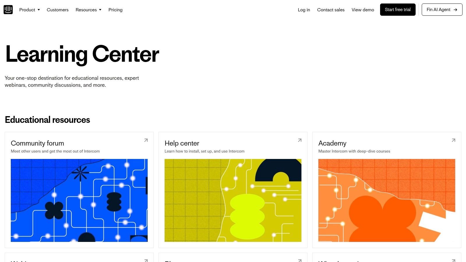
The hybrid model that works
This model tends to age better than pure editorial libraries because the community layer keeps content discovery alive. A webinar can lead to a guide. A guide can lead to a discussion thread. A support-oriented visitor can still discover strategic material.
The risk is overlap. When teams maintain both a Learning Center and a Help Center, users can end up guessing where something lives. That's manageable if the entry points are audience-based and the naming is consistent.
One operational point often gets ignored in example roundups: maintenance. Resource pages need active upkeep. A design guide summarized by Nikolai Bain's examples post recommends tracking page views, bounce rate, average time on page, and interactions with individual resources, with monthly or quarterly updates. That's useful because freshness isn't cosmetic. It's how a resource hub stays trustworthy when it includes webinars, external links, and owned assets that age at different speeds.
Keep a retirement rule. If a webinar, guide, or workflow no longer reflects the current product or process, archive it or replace it.
7. Twilio Segment Resources
Twilio Segment Resources is one of the better examples of a resource hub serving multiple roles without collapsing into vague messaging. Marketing, analytics, privacy, AI, and data topics all live under the same umbrella, but the taxonomy still feels coherent.
That's hard to pull off. Multi-persona resource pages usually break in one of two ways. They either become too generic to satisfy anyone, or they fragment into disconnected content pools. Segment avoids most of that with strong topic labels, content-type filters, and a visible connection to implementation depth through its broader ecosystem.
What makes it commercially useful
This is the best model in the list for teams that need one hub to support thought leadership and pipeline generation. Reports, webinars, guides, and case studies can all coexist if the filters are strong and the audience paths are clear.
That last part matters because case studies don't just fill a proof slot. They can materially change how a resource page performs when used well. One verified benchmark states that a high-performing resource page example featuring case studies can produce a 3.2x increase in conversion rates for SaaS lead generation when it pairs real before-and-after metrics with structured data visualization. I wouldn't treat that as a universal promise, but the directional lesson is solid. Outcome-led proof assets work better when they're easy to scan and compare.
Segment's main drawback is funnel skew. The hub leans more toward mid- and late-funnel education than broad beginner content. Some legacy page transitions can also create minor friction. Even so, for B2B companies targeting several roles at once, this is a strong commercial blueprint.
Top 7 Resource Page Comparison
| Resource hub | 🔄 Implementation complexity | ⚡ Resource requirements | 📊 Expected outcomes | 💡 Ideal use cases | ⭐ Key advantages |
|---|---|---|---|---|---|
| HubSpot Resource Library | High, complex taxonomy, filters, gated flows | High, large content volume, templates, landing pages | High traffic + strong lead qualification and cross-linking | Broad marketing library, top-to-mid funnel lead gen | Clear IA, repeatable asset types, mix of gated/ungated |
| Zapier Guides (Learning Center) | Medium, series structure + ties to Help Center | Medium, writers, product experts, regular updates | Improved product adoption and SEO visibility | Product education, onboarding, workflow tutorials | Actionable step-by-step guides and strong internal linking |
| Stripe Developer Resources | Medium, integration with docs and dev tools | Medium–High, SDKs, sample apps, tooling maintenance | Faster developer onboarding and reduced time-to-first-transaction | Developer-focused onboarding and technical implementation | High-quality docs, direct tooling access, developer-centric flows |
| Webflow University | High, courses, interactive objects, assessments | High, video production, interactive design, curriculum | Deep skill acquisition, high engagement and retention | Hands-on learning, video-heavy tutorials, PLG motion | Engaging learn-by-doing structure and clear progression |
| Shopify Help Center (Resource Hub) | Medium, task-oriented navigation and search-first UX | Medium, doc maintenance, events, community coordination | High task completion and strong lifecycle support for merchants | Merchant onboarding, migration, operations support | Comprehensive coverage across merchant lifecycle and clear wayfinding |
| Intercom Learning Center | Medium, mixes webinars, guides, and community pathways | Medium, event production, curation, community management | Balanced education + community engagement; current best practices | Combining education, events, and community for support/GTM | Format diversity and tight community integration |
| Twilio Segment Resources | Medium–High, persona-aligned taxonomy and enterprise assets | High, reports, playbooks, events, integration with docs | Strong enterprise lead generation and thought leadership impact | Targeting marketing/data/engineering for mid/late-funnel sales | Clear persona alignment and enterprise-friendly assets |
Your Playbook for a High-Performance Resource Page
The best resource pages are built with intent. They serve a specific audience, follow a clear structure, and are designed from day one to be discoverable and shareable. Now that you've seen what works, use this playbook to build your own link-worthy asset.
The Essential Resource Page Checklist
Before you publish, run through this checklist to ensure your page is optimized for user experience and SEO.
- Clear Value Proposition: Is it immediately obvious what the page offers and for whom?
- Logical Taxonomy: Is content grouped into intuitive categories?
- Search & Filtering: Can users easily find what they need?
- Diverse Content Formats: Does it include a mix of text, video, tools, and templates?
- Internal Linking: Does it guide users to relevant product pages, blog posts, and case studies?
- Actionable CTAs: Are there clear next steps for the user?
- Mobile-Friendly Design: Is the page fully responsive and easy to use on all devices?
- Designed for Sharing: Is the URL clean and are there social sharing buttons?
A resource page example becomes link-worthy when it does two jobs well. It helps the visitor finish a task, and it gives other publishers a clean asset worth citing. If it only does the first, usage may be fine but links will be inconsistent. If it only does the second, the page looks polished but won't earn repeat visits.
For SEO teams, the practical build order is usually simpler than people think. Start with a tight audience, define the main jobs they need to complete, create categories around those jobs, then decide which assets deserve standalone landing pages. That's the pattern behind the strongest examples above. They don't lead with design. They lead with information architecture.
Sample Link-Building Outreach Copy
Creating a great resource isn't enough; you need to promote it. Here's a simple template for reaching out to sites that might find your resource valuable enough to link to.
Subject: Quick question about [Their Website Name]
Hi [Name],
I was just reading your excellent article on [Related Topic] and noticed you linked to [Competitor/Old Resource].
My team at [Your Company] just published an in-depth [Resource Type, e.g., guide to X] that your readers might also find useful. It covers [Unique Value Prop 1] and [Unique Value Prop 2] in more detail.
Our resource page is here: [Link to Your Resource Page]
Would you consider adding it as a helpful resource for your audience? Either way, keep up the great work!
Best,
[Your Name]
Promotion also works better when your resource hub has obvious outreach angles. Original templates, curated tool collections, updated learning paths, and strong case-study pages all give you a clearer reason to contact publishers than a generic "resources" page with mixed content and no narrative.
Building and promoting a high-authority resource page takes strategic effort, but the payoff comes from compounding utility. It keeps earning traffic, supporting internal linking, and creating reasons for others to cite your brand. If a team needs outside execution help, SaasSky is one option in the market for SaaS and eCommerce brands that want support with link building and asset-driven outreach.
If you're building a resource hub that needs to earn links, not just exist, SaasSky can help shape the page structure, outreach angle, and supporting assets so the hub becomes a repeatable growth channel.