A prospect lands on your agency site after a referral, scans the homepage for ten seconds, and asks three questions right away. What do you do? Have you done it for companies like mine? Why should I trust this team with budget and pipeline?
That moment decides more deals than the visual design teams like to admit.
Good digital marketing agency website design has to resolve a real tension. Brand differentiation matters because agencies sell judgment, taste, and strategic thinking. Conversion mechanics matter because skeptical B2B buyers will not book a call on brand vibe alone. They want proof. They want outcomes with numbers attached, credible people behind the work, and a clear next step that feels worth their time.
Agency websites underperform when they try to do five jobs at once. The homepage turns into a portfolio, agency manifesto, hiring page, insights hub, and sales funnel in the same scroll. The result is familiar. Plenty of motion, weak clarity, and not enough evidence to move a serious buyer forward.
Competition makes that problem expensive. Projections suggest that by the end of 2025, the web will include well over a billion sites, with new ones appearing constantly. Your agency does not get a long audition. It gets a quick evaluation.
The sites that win new business tend to follow the same order of operations. They define the website's primary job, make the offer easy to understand, and design around proof before polish. For agencies serving startup clients, that often means aligning the site with the same positioning principles used in digital marketing for startups. Clear promise, credible evidence, low-friction action.
That is the standard. A sharper brand helps, but proof closes the gap between interest and inquiry.
Table of Contents
- Strategy First – Define Your Website's Job
- Architecting for Trust and Immediate Clarity
- Designing for Proof Not Just Polish
- Building a High-Performance Technical Foundation
- Your Launch Plan and Continuous Growth Loop
- Answering Your Top Agency Website Questions
Strategy First – Define Your Website's Job
A prospect lands on your site after hearing your name on a shortlist. They are comparing three agencies in 15 minutes. If your homepage looks polished but leaves them unsure who you help, what you do well, or why they should trust you, the design has already failed.
Agencies get into trouble here because they start with taste instead of purpose. “Modern.” “Premium.” “Clean.” Those are design preferences, not business direction. A website brief needs a harder question answered first: what job should this site perform in the sales process?
A strong agency website should help the right buyer move one step closer to a deal. That means setting clear objectives, agreeing on success criteria, assigning roles, defining budget and timeline, and measuring what happens after launch, as outlined in DesignLoud's website project management guidance.
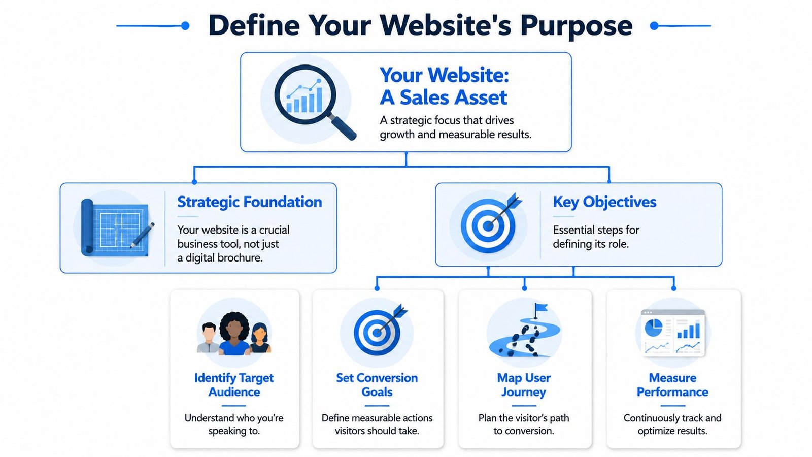
Pick one primary conversion action
Agencies usually ask one website to do too many jobs at once. Win inbound leads. Pre-sell the pitch. Recruit talent. Publish insights. Impress peers. Support referrals. Those goals can coexist, but one of them has to lead.
Pick the primary conversion action based on how you close business:
- Discovery call booking if your sales process starts with a strategic conversation.
- Qualified contact form submissions if your team needs budget, scope, or channel context before the first call.
- Email capture if buyers need education and proof over a longer sales cycle.
- Direct service page entry if you sell a narrow offer with clear intent behind the search.
This choice shapes everything upstream. Headlines get sharper. Calls to action stop competing with each other. Proof can be arranged around the buyer action that matters most.
I usually test strategy with one question: what should a qualified visitor do next, and why would they feel ready to do it? If the team cannot answer that cleanly, the site is still in the mood-board stage.
Decide what to optimize for first
Newfangled argues in its agency homepage design analysis that the homepage should explain what the agency does and guide visitors deeper into the site, not entertain them. That distinction matters because many agencies overinvest in visual flair before they have earned clarity.
There is a real trade-off here. A distinctive brand can help you attract the right clients, support premium pricing, and signal taste. But conversion mechanics still decide whether a skeptical buyer keeps reading. If the site looks impressive and says little, you get compliments instead of opportunities.
For B2B agencies, especially, the homepage should answer five questions fast:
- Who do you help?
- What problem do you solve?
- What outcomes do you improve?
- Why should I believe you?
- What should I do next?
That fourth question gets ignored too often. Buyers do not sign because a site feels expensive. They sign because the site reduces risk. The strongest strategic briefs force teams to define proof early: quantified outcomes, credible client examples, channel expertise, and the people behind the work. That is how you balance differentiation with conversion. Brand earns attention. Proof earns action.
This matters even more for startup-focused firms. Founders and growth leaders are not looking for broad agency language. They want evidence that you understand stage-specific constraints, approval friction, CAC pressure, and a smaller team doing too much at once. In startup-focused positioning, focused messaging usually beats generalist claims, especially for agencies serving companies that need digital marketing for startups.
A useful website strategy brief can fit on one page. Include the ICP, primary conversion action, buying objections, proof requirements, and the single message a qualified visitor must grasp within seconds. If that document is vague, the finished website will be vague too.
Architecting for Trust and Immediate Clarity
Once the website has a job, structure becomes more important than decoration. Most agency buyers don't browse in a relaxed way. They scan. They compare. They look for signals that reduce risk. Good architecture helps them do that without friction.
For agency websites, the most impactful pages are the homepage, about page, services page, case studies or portfolio, blog, and contact page. The homepage should state the offer, audience, and differentiation within the first five seconds, and the case-study page is described as the most important page for proving value and supporting sales in Elementor's agency website guidance.
What the core pages need to do
The homepage should pass a five-second test. A qualified visitor should understand who you help, what you help them achieve, and where to click next. If your hero section leads with a slogan that could belong to any agency, it's wasting the highest-value real estate on the site.
The services page shouldn't just list deliverables. It should frame each service around buyer intent. Someone searching for SEO, paid acquisition, content strategy, or web design usually wants to know three things quickly: what's included, who it's for, and how the engagement works.
The about page should build practitioner-led credibility. Skip the corporate autobiography. Show the people doing the work, how the team thinks, and why clients trust your process. Buyers want evidence that the agency is staffed by operators, not just account managers.
Agencies often underuse the About page. It's one of the easiest places to reduce perceived risk before a sales call happens.
The case studies page carries the sales burden. If the homepage gets attention, case studies convert that attention into belief.
The contact page should remove hesitation. Clear options matter. Some visitors want a call. Others want to send requirements first. Others need reassurance about whether they're a fit. Don't force every lead into the same path.
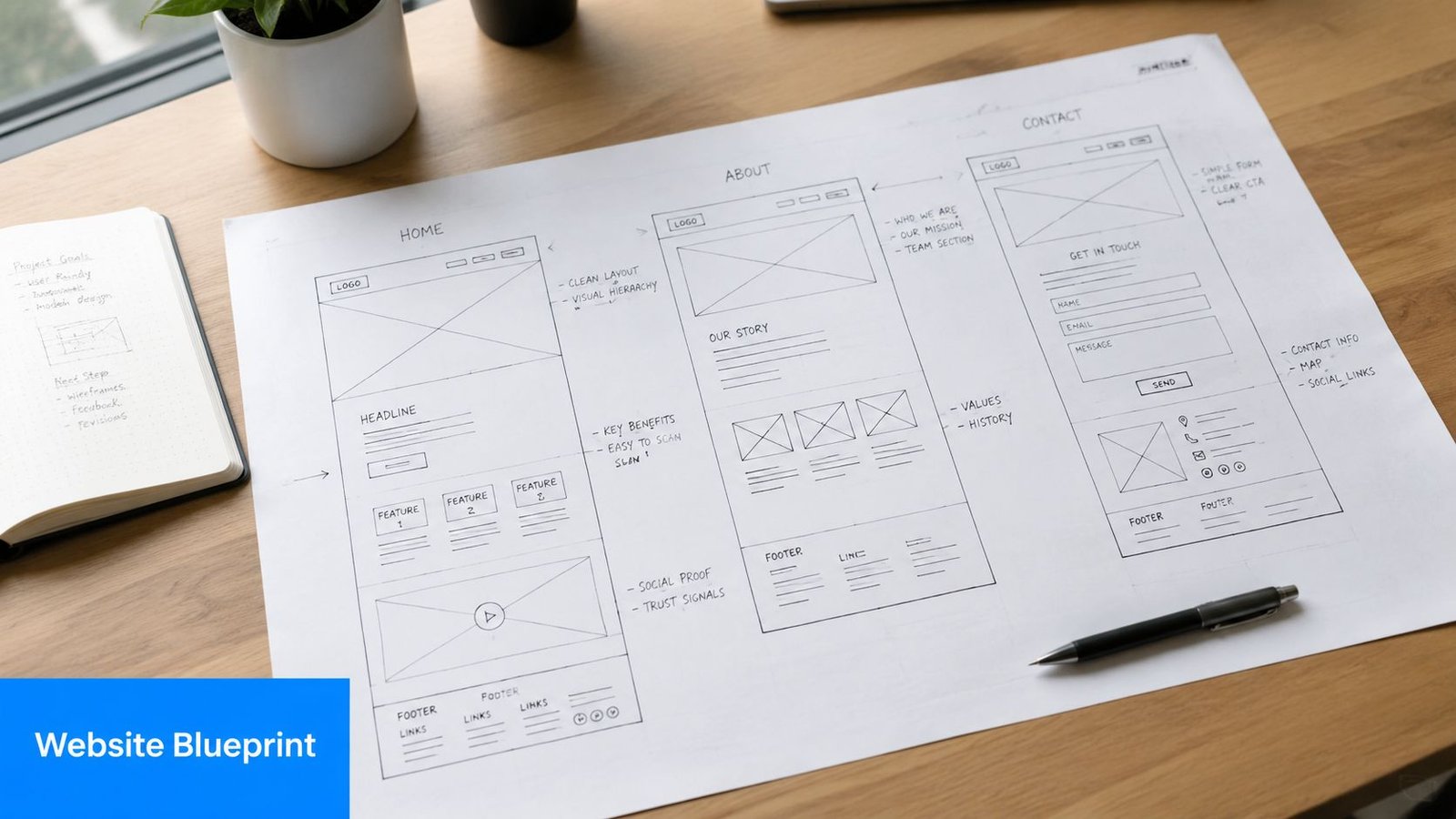
A simple agency sitemap that works
A practical site structure for most agencies looks like this:
| Page | Main job | What belongs there |
|---|---|---|
| Homepage | Establish clarity fast | Positioning, proof highlights, service paths, CTA |
| Services | Match intent | Problem, approach, deliverables, fit, CTA |
| About | Build trust | Team, philosophy, process, credentials |
| Case Studies | Prove outcomes | Challenge, work, results, visuals, testimonial |
| Blog | Support discovery and authority | Insight articles tied to services and buyer questions |
| Contact | Convert intent | Contact form, call option, expectations, fit notes |
If you're not sure whether your current structure supports that flow, a structured review using a website auditing checklist usually exposes the problems quickly. You'll see mixed CTAs, missing proof, vague headlines, and pages that rank conceptually but don't help sales.
A final note on navigation. Keep it boring in the best way. Clever labels slow people down. “Results” beats “Wins.” “Services” beats “Capabilities Studio.” In digital marketing agency website design, clarity wins more deals than originality in menu copy.
Designing for Proof Not Just Polish
A lot of agency websites sound confident. Fewer make the buyer feel safe. That difference usually comes down to proof.
Consider two versions of the same case study. The weak one says the agency helped a B2B company improve visibility, refreshed the site, and supported growth through a multi-channel strategy. It includes a few polished screenshots, a short testimonial, and a generic conclusion about partnership.
It looks fine. It doesn't sell.
The stronger version tells a tighter story. The client had a specific problem. Revenue was slowing, lead quality was uneven, or the old site couldn't support the sales process. The agency diagnosed the issue, made clear strategic choices, and documented what changed. It shows the work, not just the output.
Agency-site guidance increasingly emphasizes results with charts, badges, and behind-the-scenes process, while technical best-practice guidance also stresses speed and optimization as trust signals. That combination creates a need to structure proof carefully for skeptical B2B buyers, as discussed in Framer's marketing agency website examples.
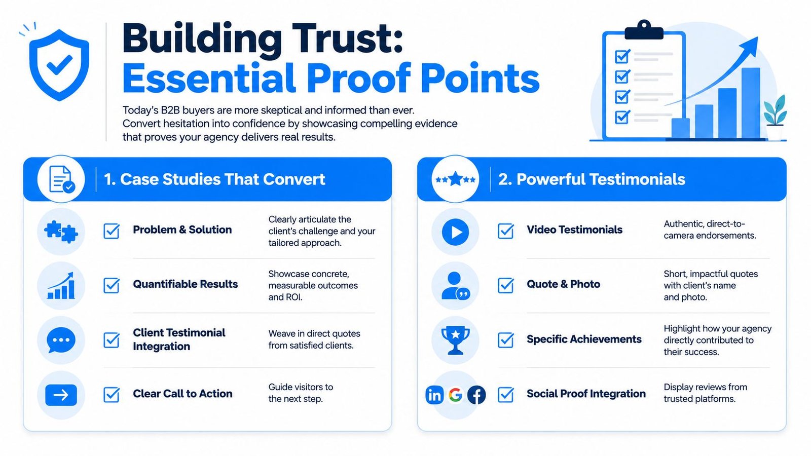
The difference between a weak case study and a persuasive one
A persuasive case study usually follows a simple narrative:
The problem
Name the business context, not just the channel issue. Was the brand entering a new market, rebuilding demand generation, or trying to turn traffic into qualified pipeline?The playbook
Show the decisions. What changed in messaging, UX, landing page structure, offer framing, content architecture, or acquisition support?The proof
Use concrete evidence when you have it. If there are verified outcomes you're allowed to publish, present them visually. If there aren't, show process artifacts, decision rationale, stakeholder quotes you have permission to use, and before-and-after comparisons in structure or positioning.
A case study should answer one buyer question above all others: “Can these people solve my version of this problem?”
That's why “we redesigned the site” is weak language. It centers the agency's activity. “We rebuilt the service page structure around commercial intent and added proof blocks to support buying decisions” is stronger because it explains the mechanism.
How to handle pricing without hurting sales
Pricing pages make agency owners nervous for a reason. Publish too much, and you fear scaring off leads. Publish too little, and buyers assume the process will be opaque, expensive, or slow.
The answer usually isn't all-or-nothing. A smart pricing page can do three jobs at once:
- Set planning expectations
- Pre-qualify bad-fit leads
- Signal confidence and transparency
For some agencies, that means listing starting points. For others, it means packaging work by engagement type. In both cases, the page should explain what affects scope. Complexity, number of templates, research depth, copy support, CMS requirements, and post-launch optimization all shape the final investment.
The strongest pricing pages pair numbers, when appropriate, with context. They help the buyer understand value and fit. They don't dump fees onto the page and hope for the best.
This is also where team credibility matters. If you claim strategic work, show the strategists. If you claim operator-led delivery, introduce the operators. If you want buyers to trust your recommendations, the site has to make the people behind the work visible.
Building a High-Performance Technical Foundation
A prospect clicks from search, the page stalls, the layout jumps, and the contact form lags on mobile. You do not get a second chance to explain your process after that. Technical quality shapes how competent your agency feels before the buyer reads a case study or books a call.
That trust hit is measurable. 94% of first impressions are influenced by website design, users form opinions in 0.05 seconds, 53% of mobile users abandon sites that take longer than 3 seconds to load, and 38% of visitors leave because of poor design or content, according to Hostinger's web design statistics roundup. For an agency site, performance problems do more than hurt user experience. They weaken the proof your brand is trying to communicate.
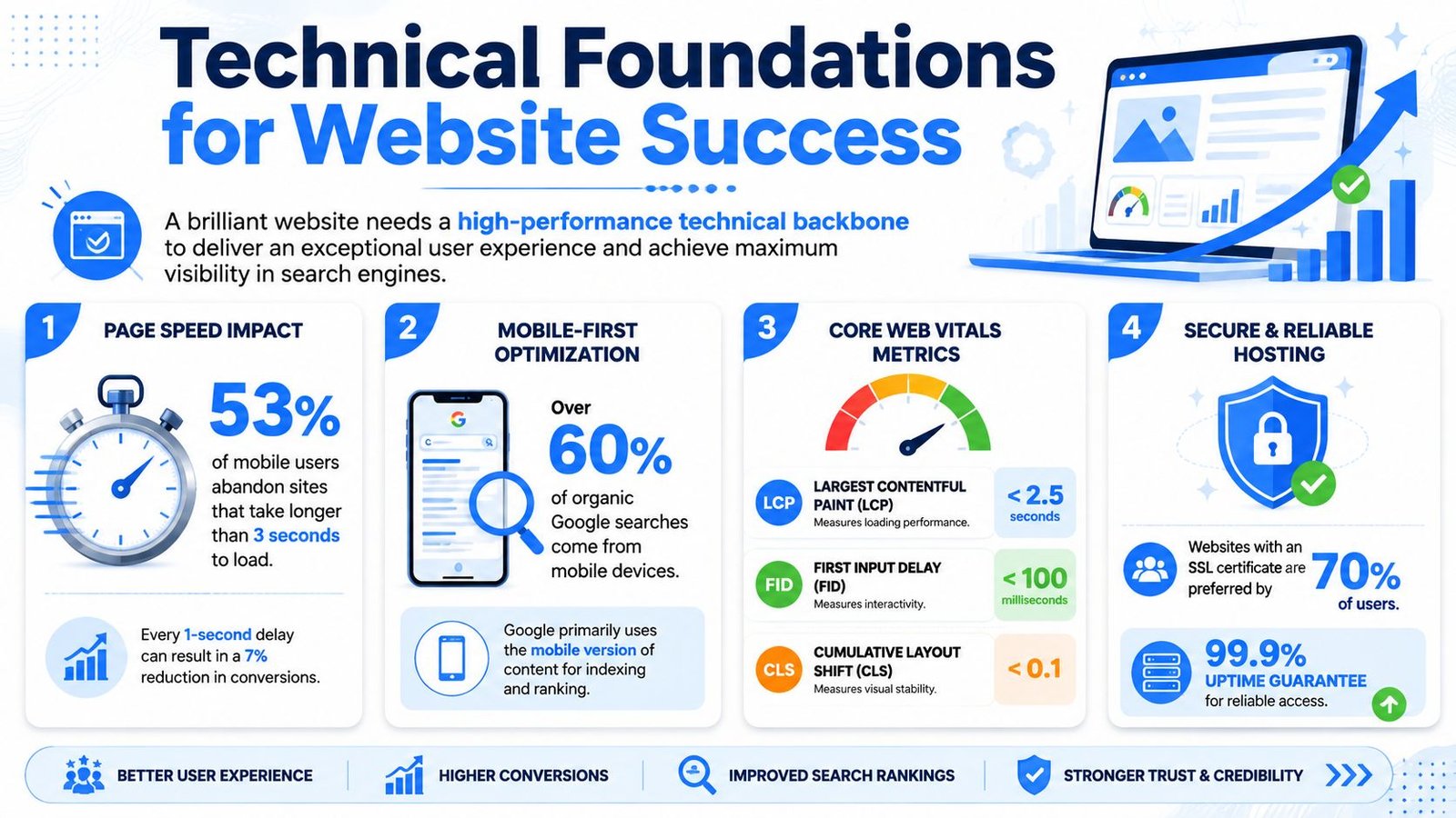
Performance is part of trust
B2B buyers rarely separate brand impression from site behavior. They experience one thing. Confidence, or doubt.
I have seen agencies spend heavily on positioning and visual design, then lose intent because the build introduces friction at the worst moment. Heavy scripts, oversized video, bloated templates, and careless mobile QA all send the same message. The agency talks about results but does not run a tight operation.
Responsive design also sits in the baseline category now. As noted earlier in the article, broad adoption has made mobile-friendly execution an expected standard, not a persuasive differentiator. The opportunity is not to claim responsiveness. The opportunity is to make the site feel fast, stable, and easy to use under real buying conditions.
What to prioritize in the build
The right stack is usually the one your team can maintain without slowing publishing, testing, or SEO work. I would choose a simpler system with clean templates over a more impressive setup that depends on workarounds and extra plugins.
Focus on the parts that protect conversion and proof:
Keep pages lightweight by default
Use only the scripts, animations, and media that support the sale. Decorative effects often cost more in speed and clarity than they return in persuasion.Design the first screen to do real work
Clear headlines, visible calls to action, and immediate proof help buyers orient fast. That reduces the need for flashy motion tricks and lets the page start converting before every asset finishes loading.Build service pages around intent, not site map symmetry
Each core offer needs its own page with a specific job: match a search, explain the problem, show evidence, and move the buyer forward. Those pages often drive more qualified pipeline than the homepage because they meet prospects closer to the moment of need.Use credibility signals that fit your sales motion
Regional agencies should show location relevance. Specialist agencies should show certifications, operator experience, platform depth, or niche results. Generic trust badges do less work than proof that matches the buyer's actual risk question.Plan SEO while pages are still being structured
URL paths, internal links, heading logic, and content depth should be set before design approval, not patched in later. A practical guide to understanding search engine optimization helps teams align structure and visibility early.
The trade-off is simple. Every technical choice either supports proof or distracts from it.
Fast, stable pages help your quantified outcomes land. Clear templates make team credibility easier to surface. Clean architecture helps search pages rank, forms submit, and attribution stay intact. Good technical execution stays out of the way so the buyer can focus on the evidence that you can solve their problem.
Your Launch Plan and Continuous Growth Loop
A new agency site often gets praise in week one, then misses the ultimate test in week four. Sales starts hearing softer objections, the wrong leads fill out forms, and high-intent visitors stall on pages that looked great in review. Launch is where that pattern becomes visible.
Treat launch as the start of evidence gathering. The job now is to confirm that the site is attracting the right buyers, proving the right claims, and helping sales close with less friction. If your positioning depends on differentiation, this matters even more. A distinct brand can earn attention. Proof is what turns that attention into pipeline.
What to check before launch
Pre-launch review should protect three things: lead flow, attribution, and trust. I use that lens because it forces better decisions than a generic QA pass.
| Phase | Task | Purpose |
|---|---|---|
| Pre-launch | QA every template on mobile and desktop | Catch layout, CTA, and readability issues |
| Pre-launch | Test all forms and call-click actions | Prevent lead loss |
| Pre-launch | Confirm analytics events and goals | Preserve attribution and reporting |
| Pre-launch | Review redirects for replaced URLs | Protect search equity and user access |
| Pre-launch | Check metadata and page indexing settings | Avoid visibility problems |
| Pre-launch | Proofread final copy in the live environment | Catch publishing errors and broken formatting |
Then check the parts teams skip.
Make sure thank-you pages, auto-responses, CRM routing, and calendar handoffs work the way sales expects. Review every proof element in context. Case study links, testimonial attribution, team bios, platform badges, and outcome claims should all be accurate and current. A single outdated client logo or vague result statement can weaken the trust you worked to build across the rest of the page.
Leadership also needs a clear read on what success looks like first. Some sites should improve qualified form fills. Others should increase booked calls from service pages or get more decision-stage traffic into case studies. Pick the primary win condition before launch so the first month does not turn into opinion-driven feedback.
What to measure after launch
Early reporting should focus on buyer behavior, not traffic volume.
Track the actions that signal commercial intent and sales quality:
- Form submissions from core service pages
- Booked calls from primary CTAs
- Call clicks on mobile
- Case study views from decision-stage traffic
- Drop-off points on long-form pages
- User feedback from sales calls and live chat transcripts
Those numbers only become useful when paired with interpretation. If a service page gets traffic but few inquiries, the issue may be weak proof, unclear offer framing, or a CTA that asks for too much commitment too early. If buyers visit a case study page and leave quickly, the problem is often the story structure. Agencies tend to describe deliverables first when skeptical B2B buyers want to see business outcomes, scope, and who led the work.
I review post-launch data in weekly cycles at first. One pass looks at volume. The second looks at quality. Are enterprise prospects reaching out, or small projects that do not fit the model? Are buyers mentioning the proof points you intended them to notice, or asking questions the site should have answered? That is where the tension between brand and conversion becomes practical. Design can create interest, but only proof architecture reduces perceived risk.
Launch gives you a live site. Iteration turns it into a better sales asset.
The highest-return changes are rarely dramatic. Tighten a headline so it names the problem more clearly. Reorder a proof section so quantified outcomes appear before process. Replace a generic CTA with one that matches buyer intent. Add team credibility where prospects hesitate. Small edits like these compound because they improve the path from first impression to signed deal.
A strong agency website should keep getting sharper after launch. Not prettier. More convincing.
Answering Your Top Agency Website Questions
A buyer has shortlisted three agencies. All three claim strong strategy, solid execution, and measurable growth. Your site has a few seconds to answer the questions that decide whether you make the call list. Are you credible? Are you different? Can this team produce outcomes like the ones the buyer needs?
That is why these questions matter. They are not design questions in isolation. They are commercial decisions that shape how much trust your site can earn before sales gets involved.
Template or custom design
A template is a valid choice when the offer is narrow, the messaging is already sharp, and the agency has the discipline to remove anything that does not support the sale. For a focused PPC shop or a specialist landing page agency, a well-edited template can get the job done.
Custom design earns its cost when the sales motion has more friction. That usually means multiple services, longer deal cycles, different buyer types, or a need to prove expertise in a way a stock layout cannot handle well. In those cases, the advantage is not visual originality. It is control over hierarchy, proof placement, page flow, and how the site guides a skeptical buyer from interest to inquiry.
I usually frame this as a system decision. Choose the approach that lets you present your offer clearly, show proof early, and expand without rebuilding the site six months later.
How much should an agency website cost in 2026
There is no honest flat number because price follows scope, stakes, and who is doing the work. A founder who needs five pages and clear positioning has a different project than an established agency that needs service architecture, case study development, CRM integration, and a modular CMS.
As noted earlier, web design sits in a large market with a wide pricing range. That range exists because buyers are purchasing very different things. Some are buying a presentable brochure site. Others are buying a sales asset that needs to support lead quality, shorten trust-building, and help justify premium retainers.
A useful budget conversation should include:
- Scope. Page types, copy support, CMS setup, migrations, integrations, and design system needs
- Proof workload. Case study writing, testimonial gathering, team bios, credential framing, and outcome presentation
- Technical work. Performance, accessibility, search readiness, analytics, form handling, and QA
- Iteration after launch. Testing, content edits, and changes based on sales feedback
The cheapest option often leaves out the parts that influence revenue. Agencies then pay twice. Once for the build, and again when they realize the site looks acceptable but does not help close business.
Should you show your team on the about page
Usually, yes.
For B2B agencies, the team page does more than add personality. It reduces perceived risk. Buyers want to know who will shape strategy, who will manage the account, and whether the people presented in the pitch are the people behind the work. If your model depends on expertise, hiding the experts weakens the case.
There are valid exceptions. Some agencies use white-label delivery, some operate with a lean senior bench and flexible contractors, and some have legitimate concerns about poaching. In those cases, selective visibility is a reasonable choice. Show leadership, senior operators, and the people buyers are likely to meet. Give each person enough context to support credibility, not just a job title and a polished headshot.
That works best when the profiles connect to proof. Name the area they lead. Mention relevant experience. Tie their role to the outcomes your clients hire you to deliver.
One example is SaasSky, which shows transparent pricing, practitioner context, case studies, and direct contact paths in a way that helps buyers evaluate fit before they inquire.